What’s With the New Look?
You may be surprised to find a completely new front-end design to LA Lindy Hop. Well, I wanted to try out a new WordPress framework, and LA Lindy Hop was a convenient guinea pig for me to try it out on. But aside from that, I had several other goals for the re-design.
Goodbye Indiana Jones
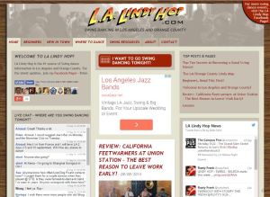 The “Indiana Jones” theme originated from my first personal home page, which eventually became LA Lindy Hop. I kept it because I figured that the Indiana Jones movies took place in the late 30’s, but that was the only real connection. Mostly, I didn’t have any better ideas for a theme at the time.
Hello Streamline Moderne!
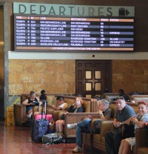 Recently, I was inspired by Union Station in downtown Los Angeles when I saw the California Feetwarmers play there, and even more so when I returned again for a downtown walking tour.
The station was designed by John Parkinson, who combined two architectural styles: Mission Revival and Streamline Moderne. Completed in 1939, this was designed in the perfect time period to inspire a Swing dance site. Plus, I just really liked the aesthetics and colors (maroon, gold, black, and white) of the place.
Better Organization
While many folks have told me how much they appreciate LA Lindy Hop, a few felt “overwhelmed” by the seemingly large amount of content on the front page and site overall. I originally wanted sort of a carnival feel where you wander from one attraction to the next. But to be honest, it was cluttered. Some people never even found the Lindy Calendar.
The re-design was an attempt to streamline the design and clean up some of the clutter. I feel like it’s a little better organized now, although there is still a lot going on on the front page due to the ads and so forth.
There is a more consistent color coding now. Dark grey for the menu bar and footer. Gold for the important top-of-page links. Turquoise for comments, chat, and stuff like that. Tan for the calendar. Light grey for stories. You always know where you are based on the color.
The Sticky Menu
One trend in web design that I really like is the “sticky menu”. That is a menu bar that “sticks” to the top of your browser even when you scroll down. The cool thing is that even if you scroll to the bottom of the page, you can still navigate to other pages without having to scroll back up. This is very useful since many of the pages in LA Lindy Hop are quite tall.
A Better Mobile Experience
While the old LA Lindy Hop site was mobile-friendly (“responsive” in web design terms), it was based on a theme developed in 2011. Three years might not sound like a long time, but in web design, it’s an eternity. Since then, there have been some great innovations like the slide-out menu in mobile mode, which are incorporated into the new site. On a mobile device, the new site looks and feels more like a mobile app.
More Immersive
The site takes advantage of the browser width, with full screen background photos on the front page.
What do You Think?
 I hope the new design is to your liking. It might take some getting used to. There are still things I need to fix, and undoubtedly there are bugs. Please report any issues you find..
While the old design was kind of quaint, the new is more professional and utilizes the latest in web design thinking. (And as a result, the site is not compatible with old browsers like IE8).
Do you like the old Indiana Jones design or the new Streamline Moderne? I designed both, so whichever you pick, I won’t be offended!
Please comment below. – Brian
Addendum
Since publishing this article, I’ve made more tweaks to the site. First, I cleaned up the “archive” pages like Swing News to display articles in a much more concise and compact format, with a uniform size for the featured image thumbnail.
Second, I removed the chat wall on the front page. It just wasn’t getting much engagement. I replaced it with a feed showing some of my existing articles, and that has seemed to get much better engagement.


Please Leave a Question or Comment
It’s great! Thank you for all you do!
Thanks Danielle!! – Brian
I love the background theme you went for! Great job! And yes less clutter! Looks good and gets the information we’re looking for!
Thank you Simple! That means a lot to me coming from a designer.
Brian
=)
Brian-
You’re a force of nature!
My only changes: Make the home page pretty, and put the calendar link in bold or red or something so people who check the calendar almost exclusively can find it immediately.
Cheers.
Doug K
Thanks Doug!!!
On the Home page, one of the four big red links at the top is a link to the Calendar, for exactly the purpose you mention. But, since you didn’t find it immediately, I might try to think of how to make it more noticeable!
Thanks for your feedback!
Brian
Actually, I have to scroll down to get to the masthead “Welcome to LA Lindyhop” with the four main sections in bold red. If it were at the very top. . .
Your new calendar format is 100% better!
You da man.
Hi Brian, I love this website! I don’t know what I would do without it! I liked the old design better. The Streamline Moderne print is nearly invisible against the turquoise of the Home page; it stands out nicely, however, against the beige background on this Comments page. Also, I’d like to see more design elements, like little illustrations or Streamline Moderne design elements, on the Home page; the Home page is a bit plain. The Indiana Jones font was a design element in itself, so it jazzed up the page. But these are petty details. The information that you offer is awesome. Also, I love the font of the “sticky” menu. And I like the lower picture of Union Station on this Comments page.
Hi Kay,
Thank you for your comments! Hmmm.. I am wondering if there is some sort of browser issue with the black-on-turquoise colors in certain browsers. It is pretty clear in my browser. Do you mind if I email you a screenshot of what it looks like on my system so you can compare to what you see in your browser?
As for design elements, unfortunately, I am not really a designer! I can do web page layout, but I am barely competent with basic Illustrator. Wish I knew how to create design elements in Illustrator. As for the Raiders logo, I drew it by hand, scanned it, and filled in the colors with software.
Thanks!
Brian